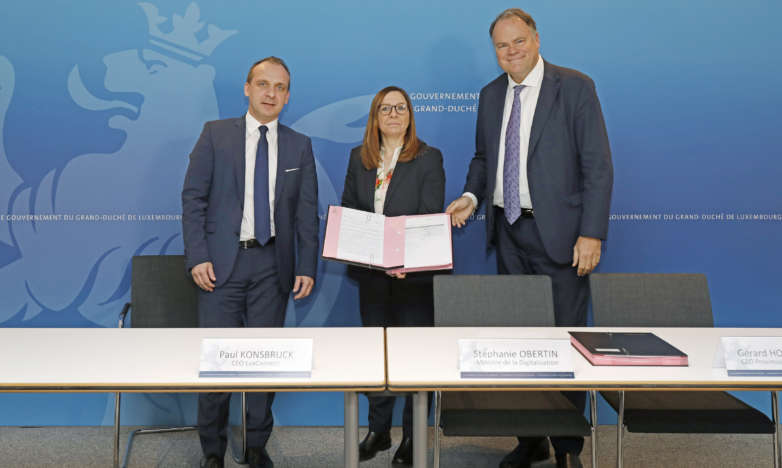
The year 2016, marked by the 10th anniversary of LuxConnect, is rich in color and events for the company. In March, LuxConnect celebrated 1,000 km of fiber cable network while beginning of June, the 4th data center will be officially inaugurated. Finally, in autumn there will be the official ceremony of the 10th anniversary.
In this same business dynamics, LuxConnect now appears under a new visual identity with a new website.
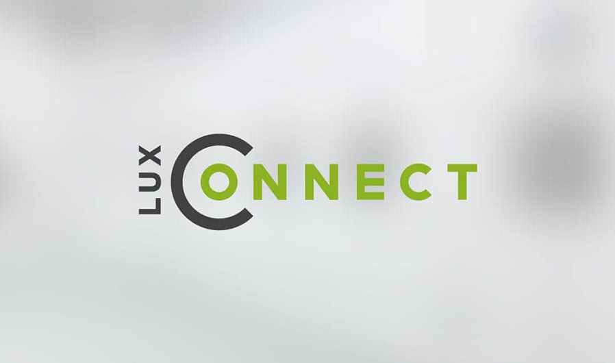
The logo of LuxConnect was modernized and appears more dynamic by the change of color. Going green is not fortuitous knowing that LuxConnect gives great importance to sustainability and is constantly looking to maximize its energy efficiency. Highlighting the letter «C» in LuxConnect in the form of an open circle symbolizes the protective bubble that the company represents for its clients. The open circle also represents openness and creativity as demonstrated by the company.
«LuxConnect has always been very concerned with sustainable development and the environmental impact of its activities. Our new visual identity underlines this approach » says Roger Lampach, CEO of LuxConnect.
In parallel with the definition of the new visual identity, LuxConnect will put a new website online under www.luxconnect.lu. The new dynamic site with modern design is built around the data centers and dark fiber activities of LuxConnect, as well as the theme of sustainability. It also displays a new section dedicated to the partners of LuxConnect. The intuitive to use website comes with harmonious pictures and referrals by partners and clients. Thanks to the «Responsive Web design» technology, the site perfectly adapts to all screen sizes including adjusted and simplified content for optimal use on mobile phones.
The site www.luxconnect.lu is by default accessible under https, a protocol that allows secure transmission of information.